
-
EOSY Gourmet Food Packaging
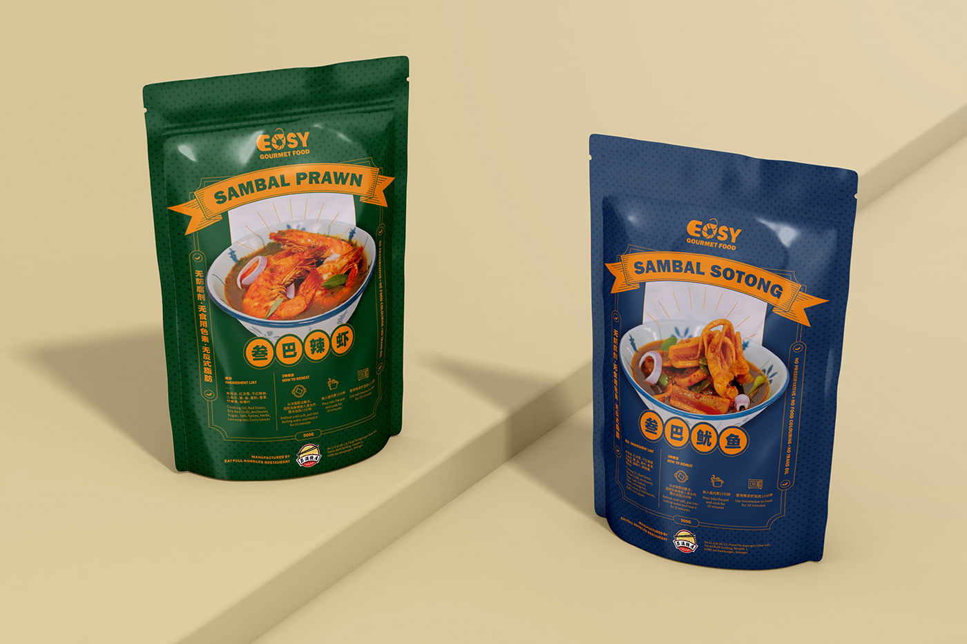
复古的包装设计对应着产品传统的制作手法,粗体标题 & 干净利落商品照,在简细的线条对比下,第一眼就直入消费者的眼帘。
采用EOSY的主色(橙色)搭配不同底色,即使不同产品系列,也能维持统一的视觉效果。饱满的颜色,反映着味道浓郁的叁巴,视觉上更有分量!为了避免画面过重,线条和文字都轻量化处理,以免模糊包装的焦点。
-
To embody the traditional production of EOSY Gourmet Food, retro packaging design is chosen by the clients. Bold titles with direct product photos attract customers at the first glance.
Using EOSY's primary colour (orange) with different background colours can maintain a unified visual effect even if there are various product lines. The saturated colour reflects the strong taste of sambal, which is more visually weighty!


-
Brand : EOSY Gourmet Food
Art Direct : YeeYn
Design : Love Kiang
Design : Love Kiang
-
2022 © Eyinteresting Design. All rights reserved.


